At the end of the 19th century and beginning of the 20th century, the Brock Brothers, Charles Edmund and Henry Matthew, created the illustrations that we have come to associate with Jane Austen’s novels (C.E.) and other classics (H.M.). Find an excellent short description of the differences in the brothers’ styles in the Karpeles Manuscript Library Museum link below.
Charles Brock (1870-1938), a skilled colourist who studied art briefly with sculptor Henry Wiles, is best known for his line work and delicate illustrations for Jane Austen’s novels. This PDF New York Times article from 1912, To Please the Eye, offers a contemporary and glowing review of one of his illustrated novels. Charles shared a studio with his younger brother Henry, who was born in 1875. Henry studied at the Cambridge School of Art and by the early 1900s was one of Britain’s most popular illustrators. The younger brother lived until the 1960’s, and some of his vintage illustrations are still quite fresh today
Learn more about the brothers in the links below:
- The Karpeles Manuscript Library Museum: Charles Edmund Brock and Henry Matthew Brock.
- Click here for more information and a contemporary assessment about the brothers in English Book-illustration of Today By Rose Esther Dorothea Sketchley, Alfred W. Pollard, 1903.
- C.E. Brock: List of illustrated books
- Three C.E. Brock illustrations
- Modern illustrators of the Regency period
- H.M. Brock: List of illustrated books
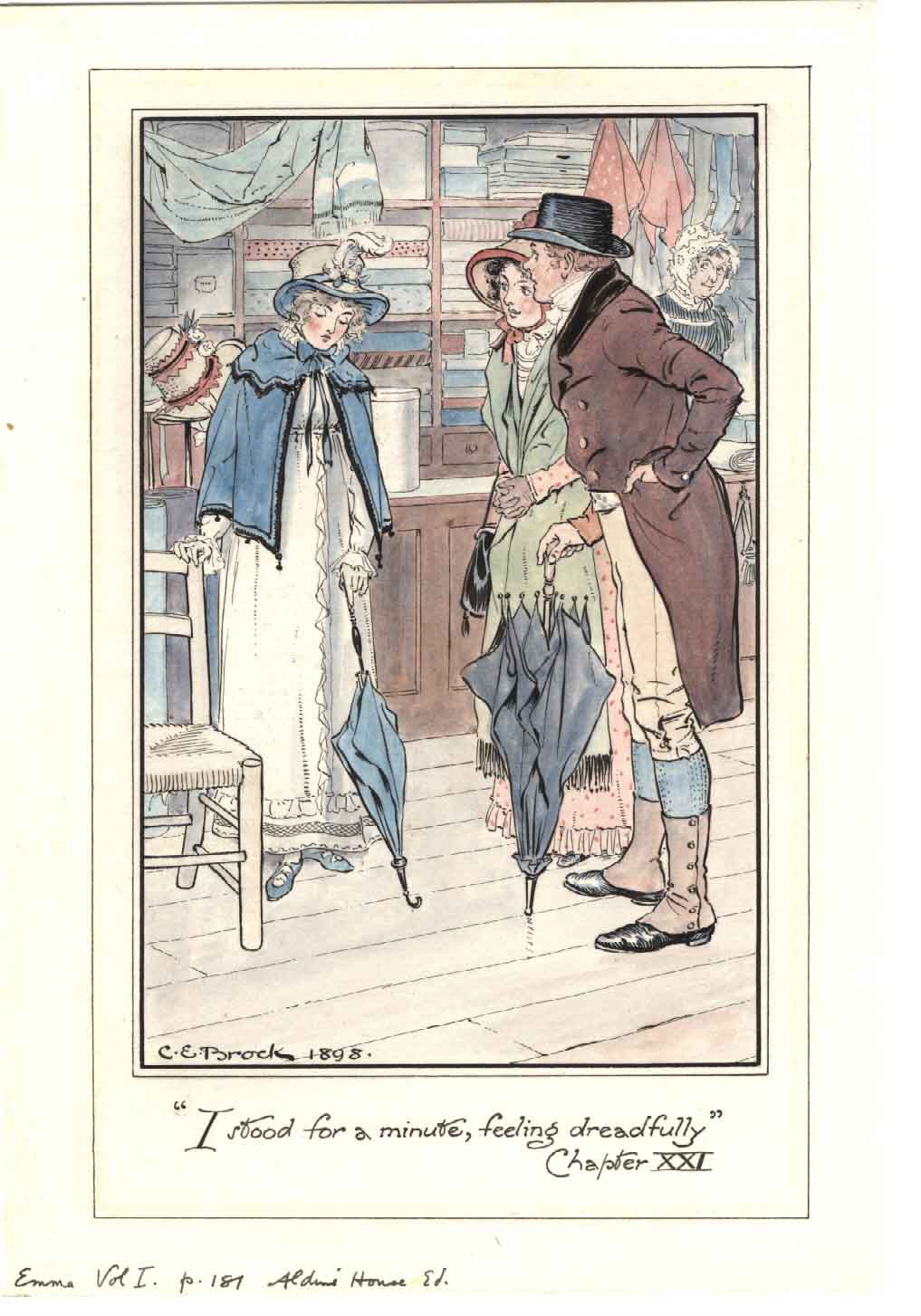
Illustration: C.E. Brock, Emma


[…] https://janeaustensworld.wordpress.com/2008/06/11/jane-austen-illustrator-ce-brock-and-his-talented-b… […]
[…] varied degrees of success at this attempt by prominent artists of their time; however Hugh Thomson, Charles E. Brock and Chris Hammond are prime examples of those who I feel have excelled. Recently, I have come to […]
[…] C. E. Brock and Hugh Thomson are better known illustrators of Jane Austen’s novels. I find it interesting that Joan Hassell, who resembled a matronly British lady, created more forceful images than these two men. Brock’s and Thomson’s works are delicate and airy, while Hassall’s are stark and masculine. Her style was defined by her medium – the wood block. Hassall worked in black and white, scraping out thin and thick lines with engraving tools, and adding stippled variations in between, yet she carved out a great amount of detail with an unerring hand. One of the reasons why I like her image of Fanny Price in Portsmouth is not only because of the robustness of the scene, but because I can practically smell the sea air. She managed to evoke waves dashing against the shore, children playing, clouds scudding by, and a stiff breeze blowing against the ribbons and short capes of the strollers. In less capable hands, this scene would have been impossible to attempt in such a small area. She also moves from light to shadow effortlessly. Witness how the ships’ masts are outlines against the white cloud bank, and how the legs of the little boy on the right, who stands in dark shadows, are limned by a single light line. Masterful. Fanny Price in Portsmouth, Mansfield Park, Folio Society, illustrated by Joan Hassall […]
[…] *Visit Pemberley.com for more information on C.E. Brock. *Keiko Parker’s “Illustrating Jane Austen” in Persuasions 11 (1985) *Jane Austen’s World Blog on the Brock brothers […]